Aesthetics is a very important aspect in information design or data visualisation. The overall design has to be aesthetically pleasing so that the viewer is interested in seeing and reading the content and the message conveyed by the artefact. One aspect explored here is the colour combination to be used for the information design or infographic on Diabetes.
Example 1
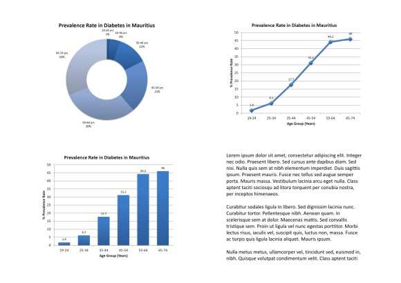
In this first example the colour of the charts have been changed from black to blue which is more attractive. The blue colour has been selected as it is the colour chosen by the International Diabetes Federation. It is to give a universal identity for Diabetes.
Example 2
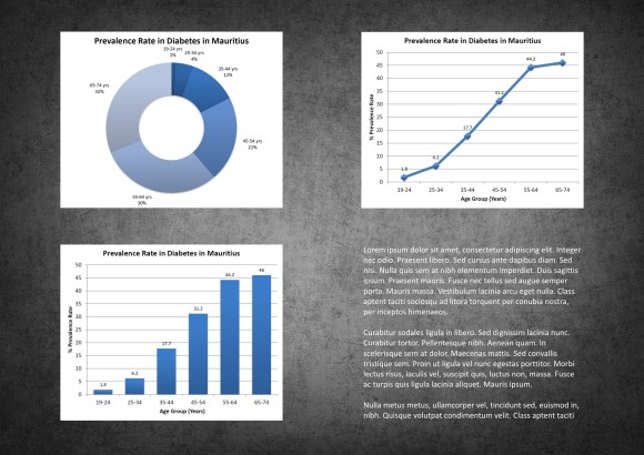
In the second example the background of the artefact has been changed to a grey textured background. This type of background has been selected as it enhances the overall appearance of the artefact providing it with some depth.
Example 3
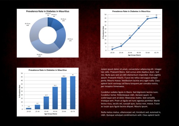
An effect has been added to the backgroung to give this dark red colour. This colour has been chosen as it makes the user to think of blood and this colour represents danger. At a glance the viewer would grasp that this artefact is dealing with something serious.
The same kind of experimentation was done for the selection of types and layout design which are shown in the development stages of the artefact.
